Murshed: A Trusted Guide for Students
Murshed is a platform that helps high school students organize their study time through personalized plans and weekly follow-ups.
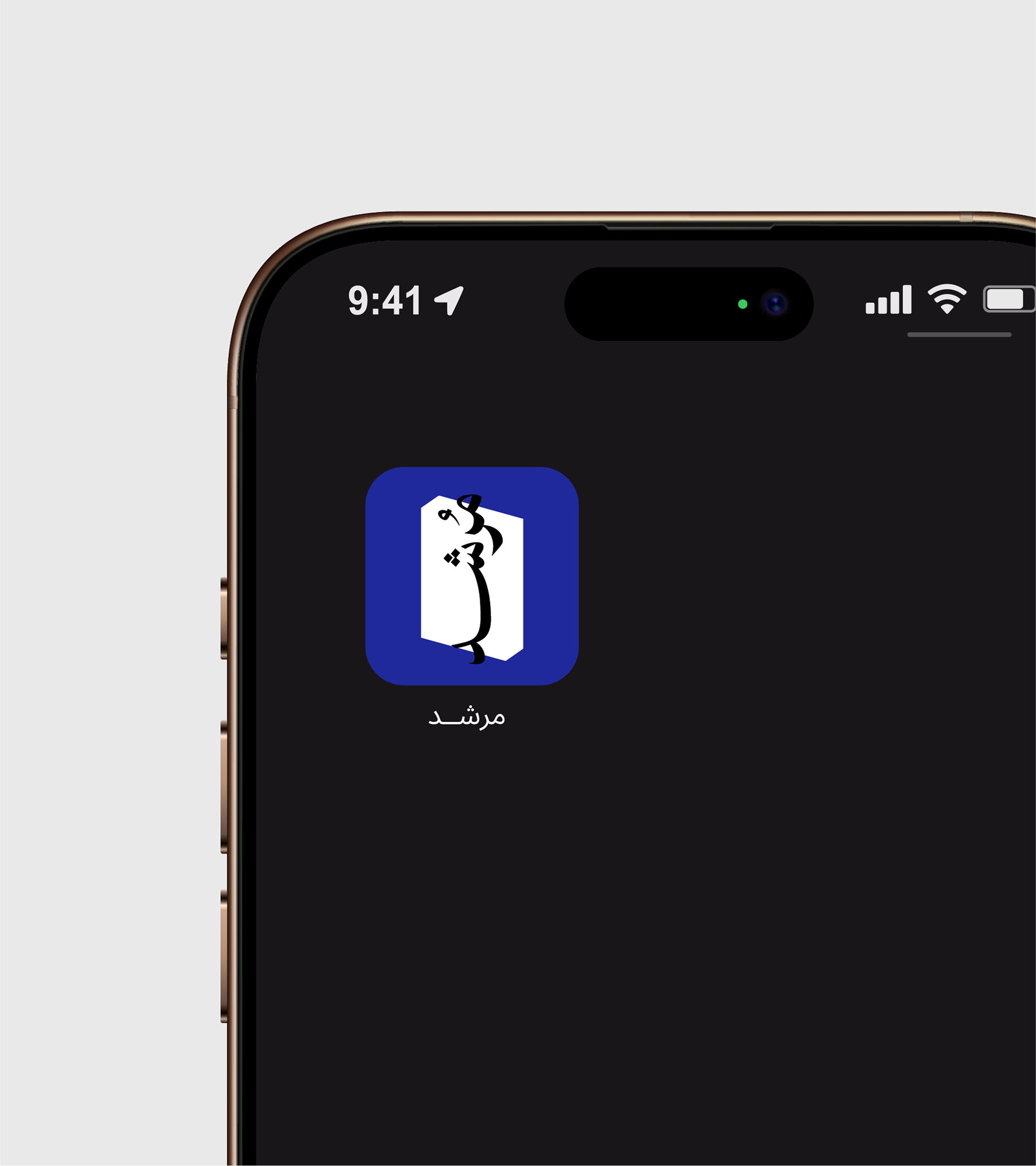
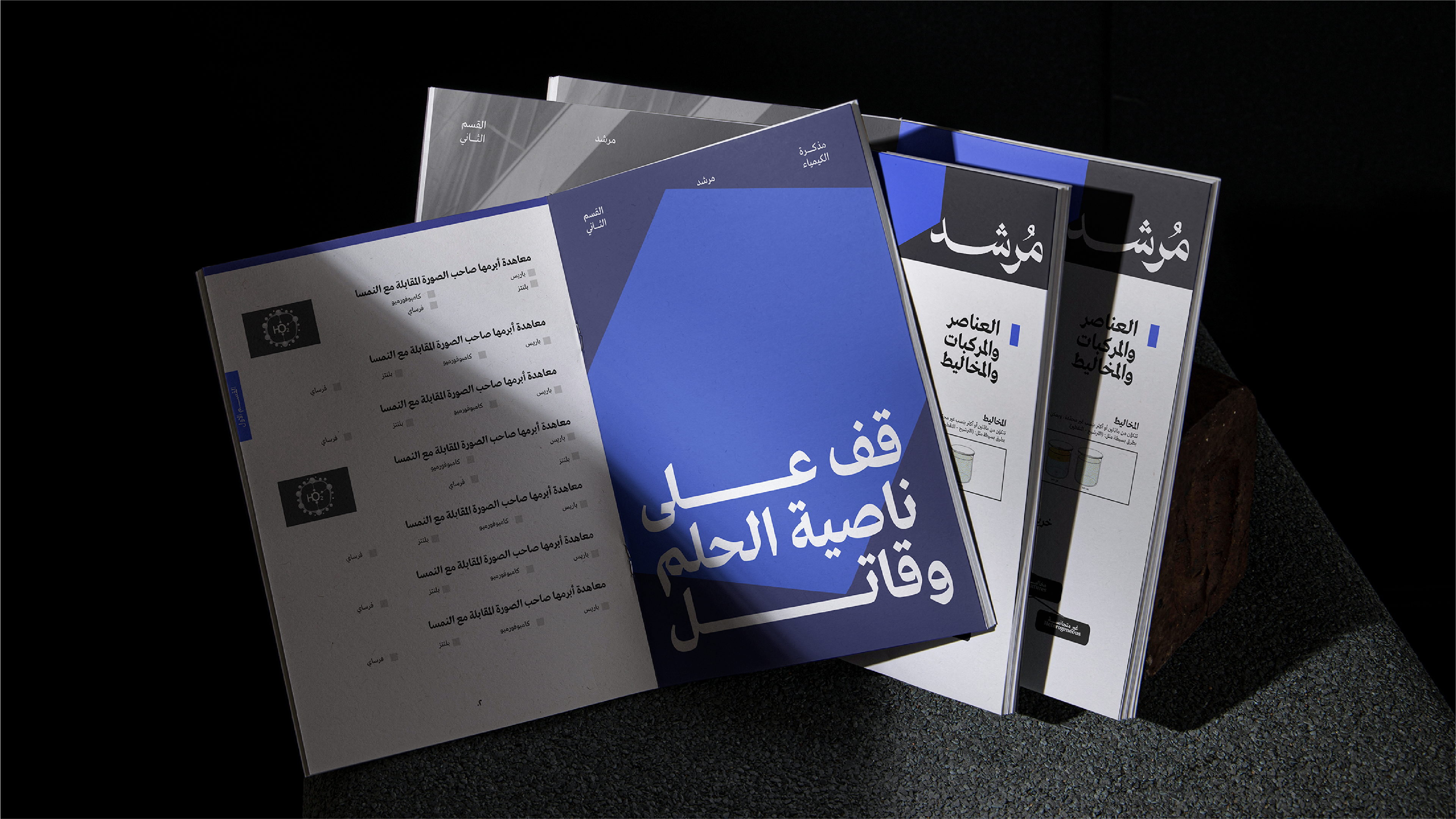
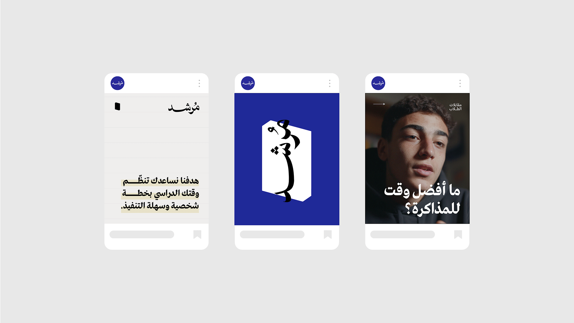
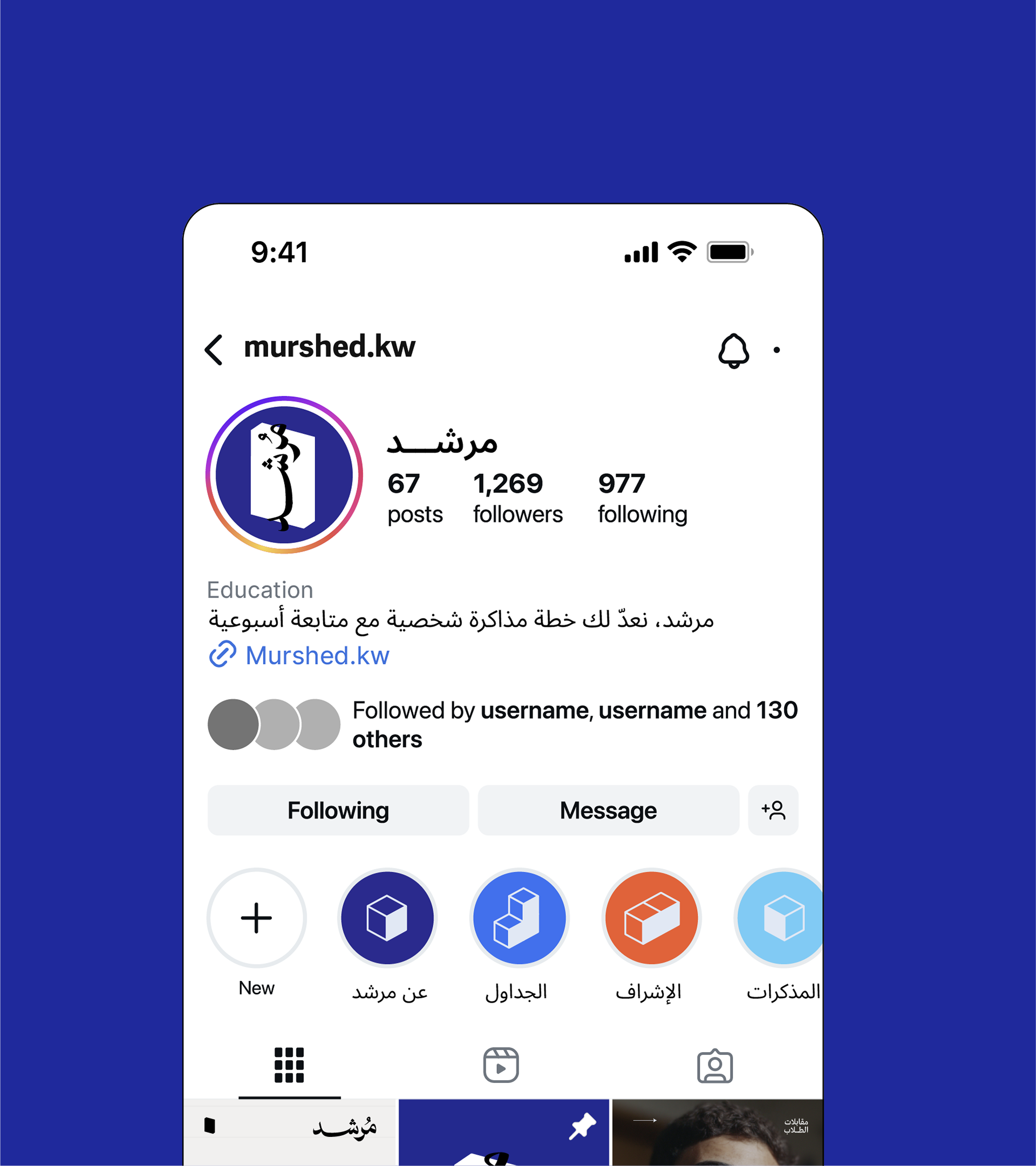
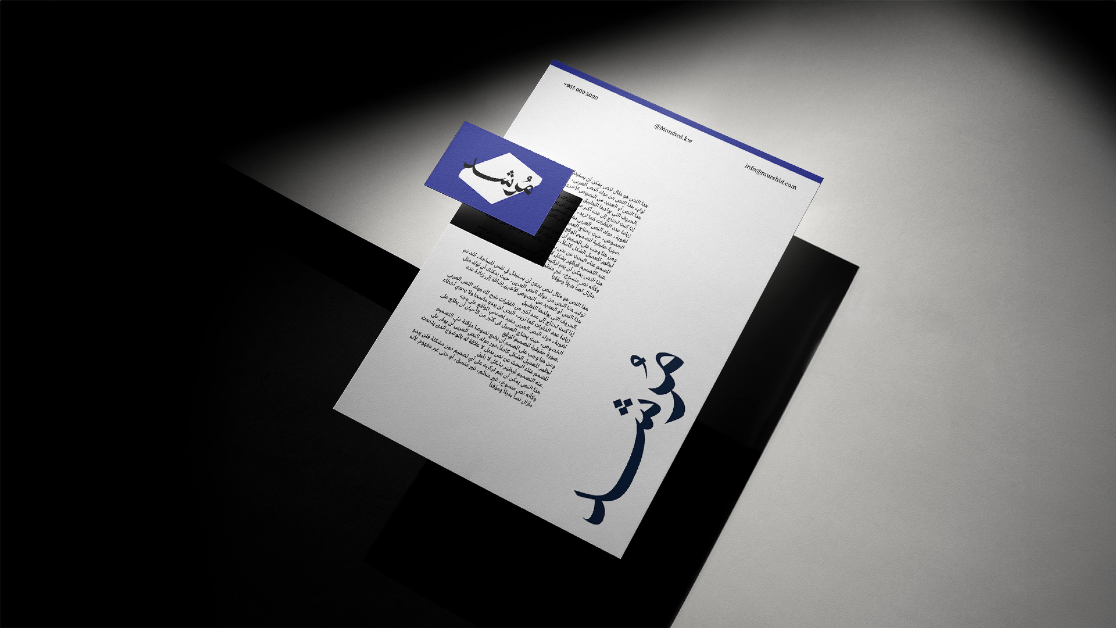
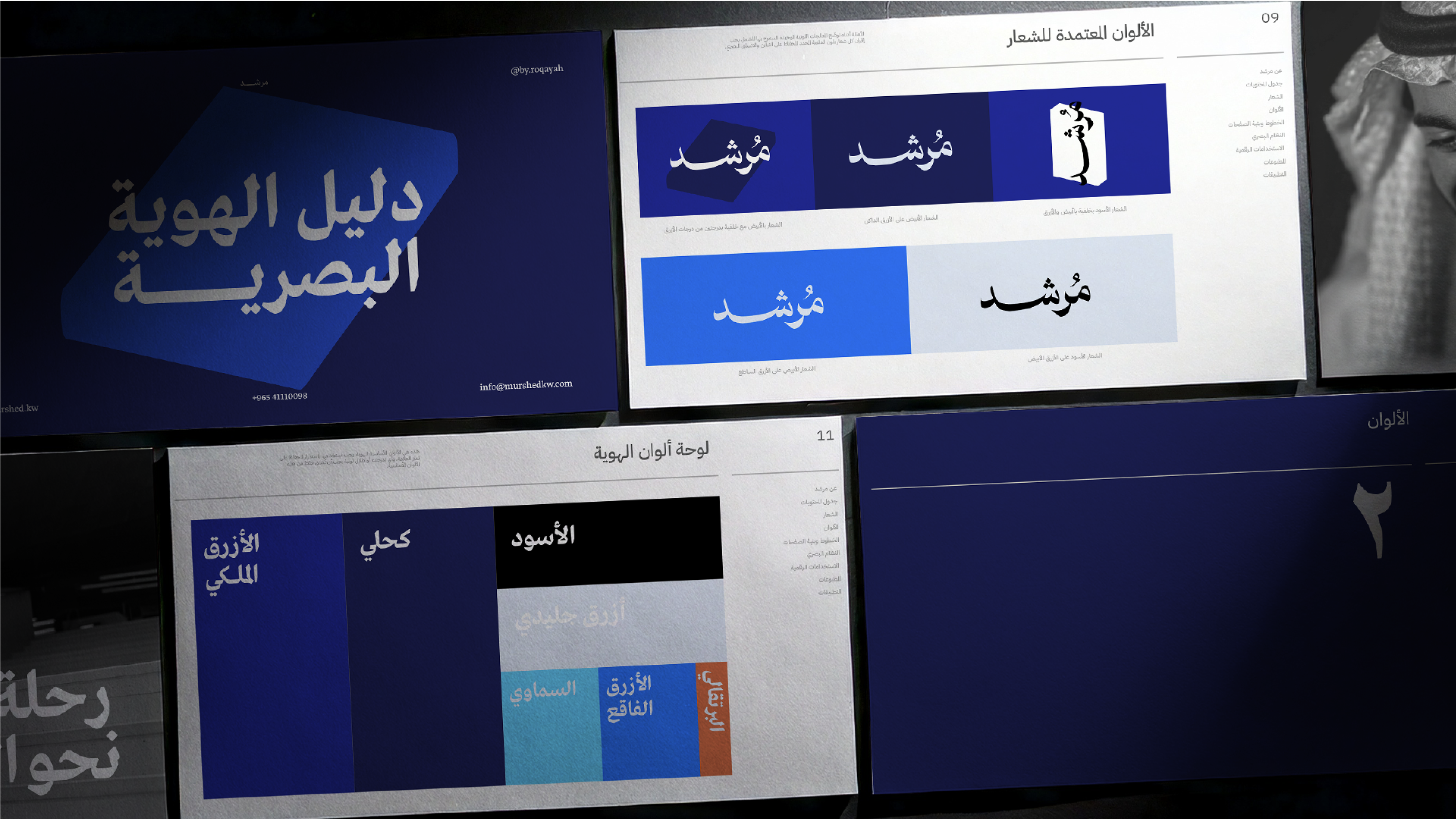
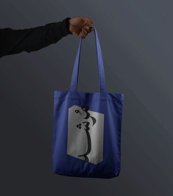
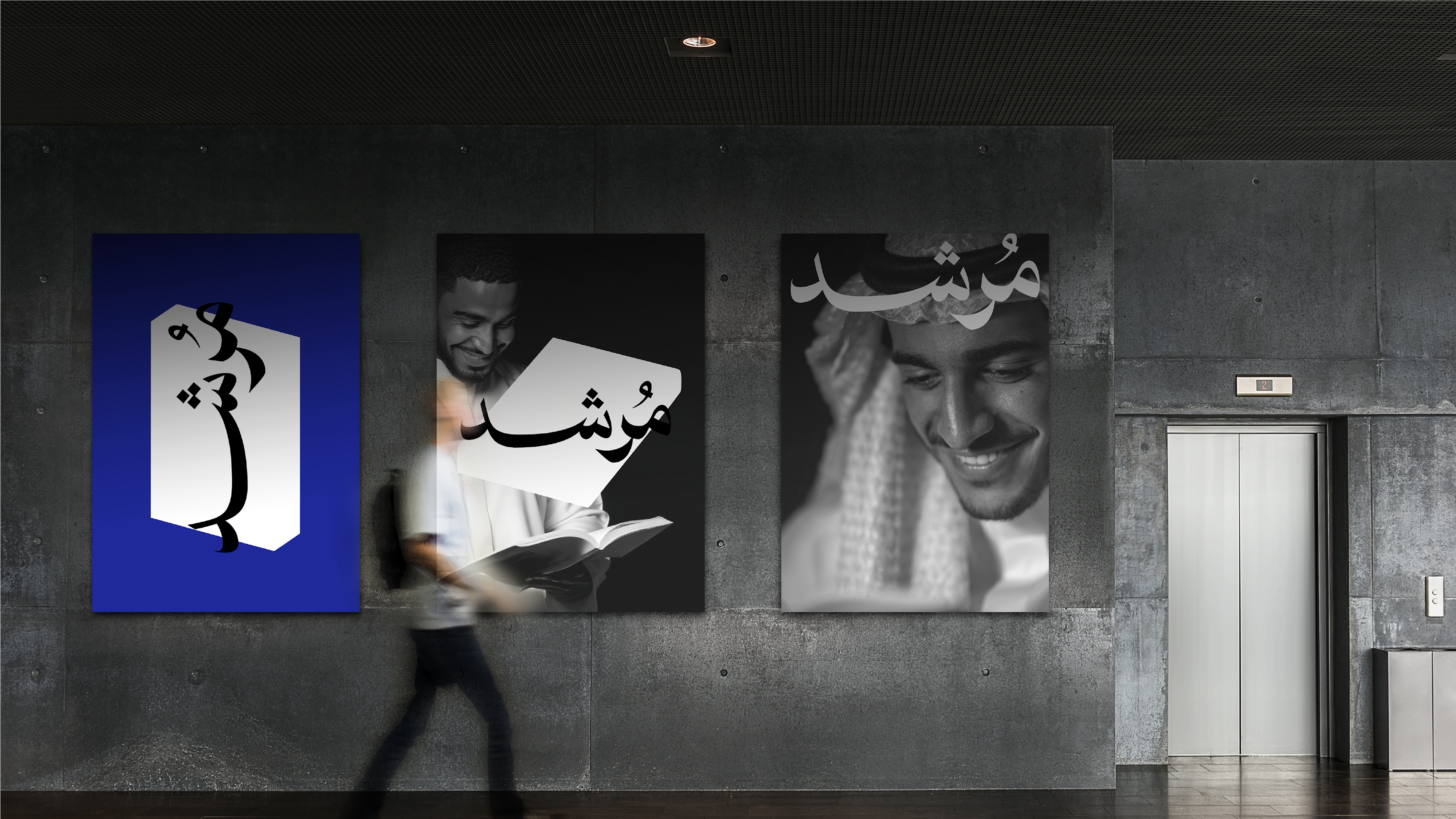
The brand identity was designed to reflect this role. The logotype is the core element, and it can also be placed on a “book block” shape. Multiple variations of the book form are used, reinforcing the idea of study, planning, and structured learning. Since the brand lives mostly in digital spaces, the overall style was developed as clean, vector-based graphics. This gives the identity a contemporary, scalable look and explains the choice of bright, saturated colors that work strongly on screens.
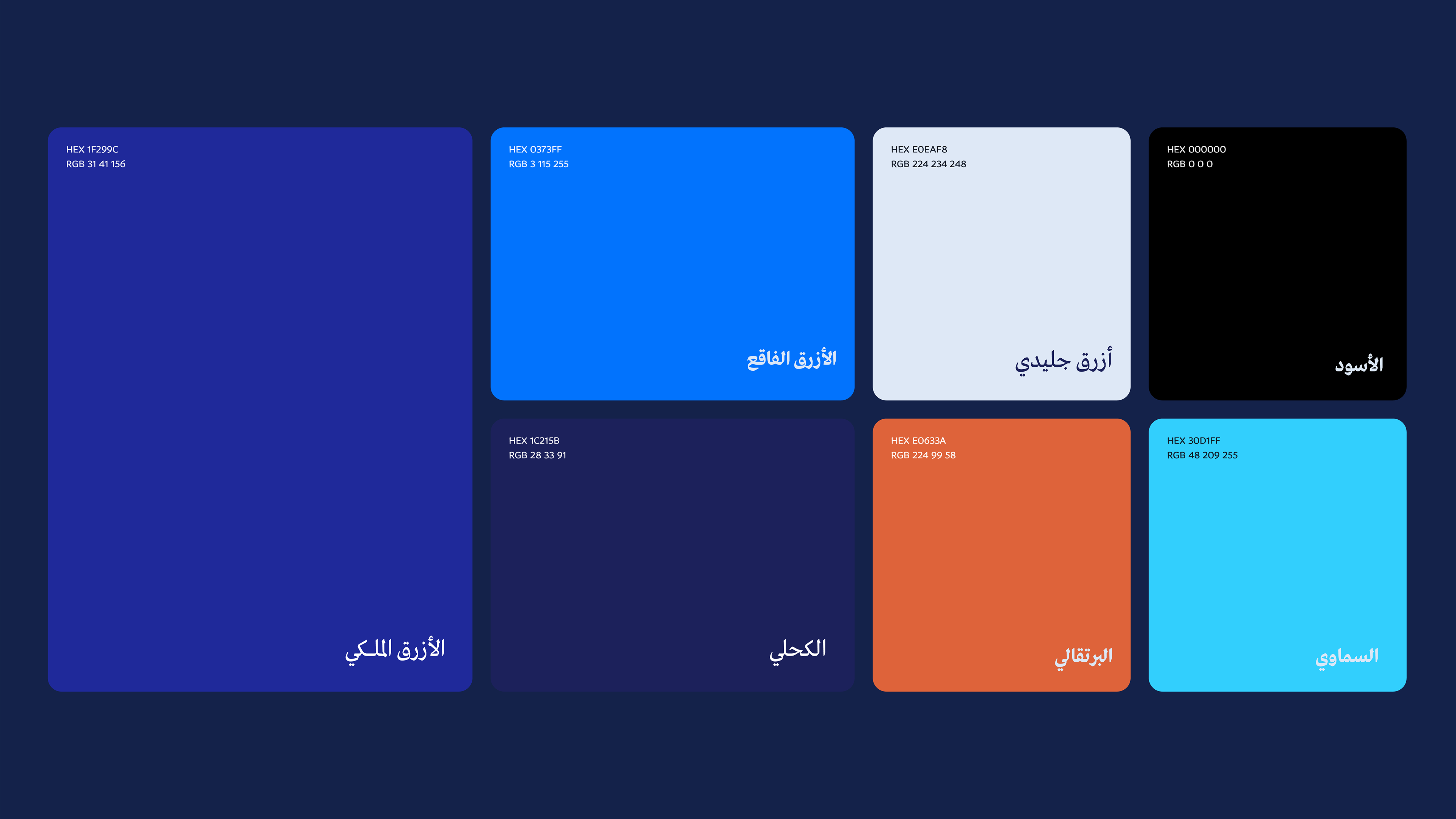
The color palette was chosen to inspire confidence and guidance, while brighter accents such as vivid blue or a touch of orange add energy and visibility. This balance mirrors Murshed’s function: a mentor figure that feels both trustworthy and motivating.
Photography complements the visual system by adding credibility and human connection. Students are shown, often in black-and-white portraits or interview settings, to ground the identity in authenticity. These images highlight genuine stories and experiences, supporting the brand’s promise to guide students with clarity and empathy.